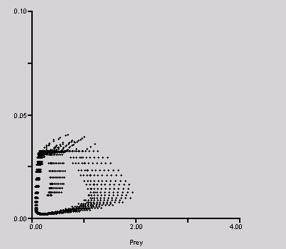
| REMUS generates outputs in tabular and graphic formats. Any of the 250 variables included in the model can be graphed or tabulated. Tables allow the user of the model to examine changes in the variables over time on monthly or yearly basis. Graphs show changes in the variables of interest over a period of any desired duration. One year is the minimum simulation time and there is no maximum. Simulation outputs can be automatically exported into another software (e.g., Excel, SAS, SPSS, MS Excel). Please find below some sample outputs generated by REMUS. I present here just five graphs and one table to give a quick overview of the capabilities of the model. Graphical outputs Figure 1. Predator versus prey: dynamic equilibrium densities of the simulated predator-prey system. This graph shows the dynamic equilibrium between the simulated populations of predators (the y-axis) and prey (the x-axis). All densities are shown as number of animals per 1 square km.
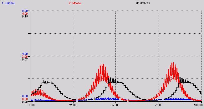
Figure 2. Dynamics of wolf (black curve), caribou (blue curve) and moose (red curve) populations over the period of 100 years under one specific management scenario. The model tracks changes in populations on seasonal basis. This causes the apparent zigzag pattern on the graphs. The low is the population density just before births (early spring); the following peak results form including the newborn young in the total population density (early summer). Densities reported as number of animals per 1 square km. Please note different scales on the y-axis for all species. The scales on the graphs can be adjusted as needed. This allows for a more detailed examination of the dynamics observed.
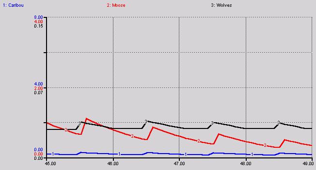
Figure 3. This graph displays the same dynamics as shown in Figure 2 (Dynamics of wolf (black curve), caribou (blue curve) and moose (red curve) populations). The only difference is the time scale (please note the change on the x-axis). In this case only four years are shown (from the 45th to 49th year of the simulation run). The newborn young cause abrupt increases in population densities in late spring. This is followed by a more gradual decrease in numbers due to a variety of mortality reasons as well as potential emigration from the system.
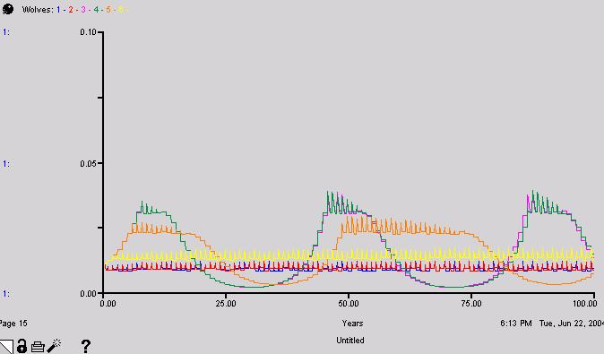
Figure 4. Wolf population dynamics. This is a comparative graph. The purpose of comparative graphs is to allow comparing the behaviors of a certain variable in a number of simulation runs under different settings of the model. REMUS allows using comparative graphs for all elements included in the model. Each curve on the graph represents a simulation run. Unlimited number of simulation runs is allowed. This particular graph displays six different population dynamics of wolf population over a period of 100 years under six scenarios (a variety of management options: strong, moderate and week wolf control, no wolf control at all control, different prey availability).
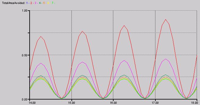
Figure 5. Total Area Avoided. This is a comparative graph displaying the total area avoided by caribou (as a propotion of the area simulated, 1=100%) due to industrial development combined with other factors (see my M.Sc. thesis for a detailed discussion) under seven different scenarios. Four years (from the 14th to the 18th simulation year) of seven simulation runs are shown.
Tabular outputs Every variable
in the model can be tabulated with a resolution varying from monthly
to yearly intervals. The table shown below displays changes in the
densities of all species (caribou, moose, wolves and prey [moose and
caribou combined]) per square km. Total adult predation (number of
adult caribou killed by wolves per month as the density of killed
caribou per square km) and adults killed (cumulative total density
of caribou killed per square km) during the 6th and 7th year of the
simulation.
All data generated and displayed in tables can be exported into any type of software used for statistical analysis (Excel, SAS, SPSS).
BACKGROUND | DESCRIPTION | TUTORIAL | OUTPUTS | HOME | OTHER USES | LITERATURE | SCREENS | FUTURE | CONTACT copyrightăPiotr
Weclaw, 2003, 2004 |